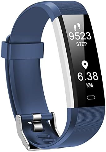
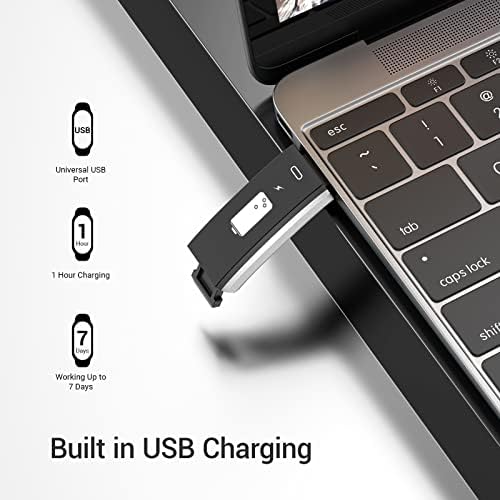
I like the band, I like how it charges, I like how it looks, I like how it fits. It seems quite accurate.
The app is terrible. First of all, it starts with an ad for a product that I am not interested in. And regardless, what app for a product that you bought is ad based? This is reprehensible.
Second, it doesn’t have my desired features. . I have not yet found a way to add steps that I know I took when I had the band off. This is a simple thing to do in the Fitbit app but not in this app.
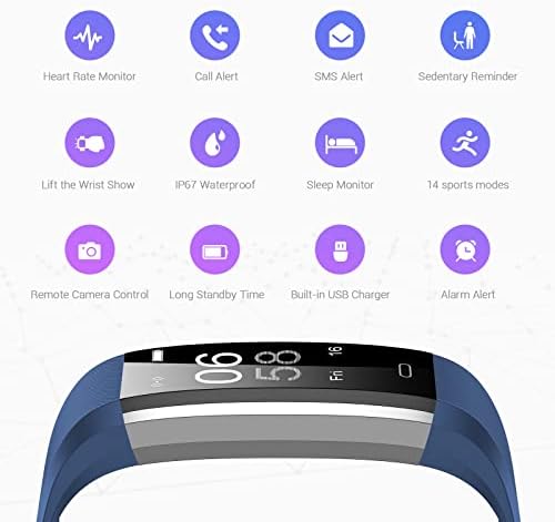
Third, it’s difficult to find anything in the app. Everything is hidden. For example, you have to go to a sublist to find the amount of battery you have left, it’s not displayed when you pull down to synchronize. It should be on every main display of the band. You shouldn’t have to choose between seeing your steps and the time and seeing the battery power. I want to see all three, and there is no way to see the battery power on the band while you’re wearing it unless you choose that display and don’t see the steps on the main display. Bad use of space.
I was able to get rid of the green flashing lights when I’m not wearing the band by turning off wrist sense. But that’s a stupid workaround. It should possibly flash a couple lights, more slowly than it does, and then only do it once when you have wrist sense on, and are not wearing the band. Instead of doing it very fast, like a flickering light, repeatedly with no end. I think the very fast flash is dangerous (if you happen to be epileptic, or be around someone who is), and it’s annoying to those to whom it is not dangerous. I’ve seen someone go into epileptic seizures as a result of flashing lights from a fire alarm. It’s not a good thing. You would think the company would see this coming as a lawsuit.
So, my mixed feelings lead me to a three star rating. This software engineers and the management have ruined a good effort by the hardware engineers.




Report